
Have you ever been to an e-commerce website and had something added to your cart without you realizing it? Or, when you’re on one website, click on an article to read and the link takes you to a whole different website and then you realize the article was an ad?
If so, you are not alone. These tricks happen every day to website users and while most users think they did something wrong to have this happen, the truth is the website was built for this exact thing to happen. These actions are examples of dark UX.
Dark UX is a way for designers and companies to manipulate their users into performing actions they may not know they are doing. The design and UX that go into it takes some thought and creative problem-solving to get users to achieve the intended action. But, once the user takes action, the company can profit off of the user not paying attention.
Below are 11 common tricks used to manipulate website users:
-
1. Bait and Switch
What it is: Just like the classic sales trick: promised one thing to lure you in, but once in, you get a completely different experience than what was promised. In the case of UX, this happens when someone sets out to do one action – which they have done many times, expecting the same outcome – but, instead, a different outcome occurs.
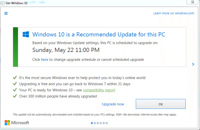
Example: A famous case of this happened in 2016 when Microsoft tried to get users to sign up for Windows 10. Users were prompted with a pop-up box to upgrade. The options in the box were to “Upgrade Now” or “OK” (which is unclear in and of itself). Like all pop-up boxes, there was also a close “X” button, but that button did not react like all others do. Clicking the “X” button upgraded the user to Windows 10 when users thought they were closing the box.
-
2. Disguised Ads
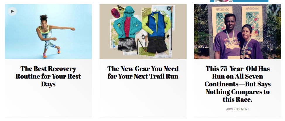
What it is: Advertisements disguised as page content when they are, in fact, advertisements.
Example: A popular place this is seen is on websites with articles. Articles will be listed or displayed in a way where the articles look alike. The only differences being the image and text with the article. If three articles are placed side by side, you would think that they are all articles for that site. Sometimes, some of these articles can be ads. The user thinks they are clicking on just another article since they look exactly like every other article.
-
3. Forced Continuity
What it is: When a user needs to enter credit card information for a free trial and, once that free trial is up, they are opted into paying a monthly fee without any notice.
Example: Some steaming services, like Hulu, used to or currently do this when you sign up for a free trial. Once you sign up with your credit card, you start to get charged – without warning – after the trial period is over.
-
4. Friend Spam
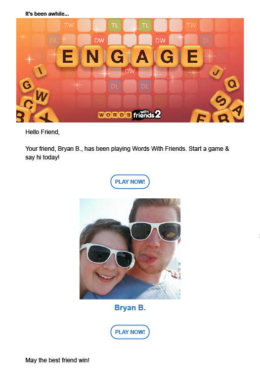
What it is: When a form or website asks for your email address or permissions to your social media account and then uses that access to spam your contacts in a message that looks like it’s from you.
Example: This is a common occurrence when signing up to play games with your Facebook account. When you sign up to play, they will ask for access to your friends and then spam them with messages.
-
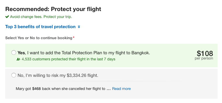
5. Hidden Costs
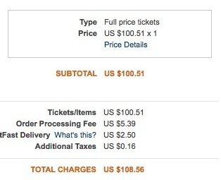
What it is: Paying for extra features or products nobody wants is frustrating. During the checkout process, this dark pattern adds additional costs to your cart total which were not previously reflected, such as shipping or care and handling fees.
Example: Ticketmaster is known to do this when purchasing tickets through them. While searching for a ticket, it will cost $100.51, but once you add the ticket to your cart, hidden fees -- like a convenience charge, facility charge, or print-at-home charge -- will be added to the cost of the ticket. A ticket with the price of $100.51 can then turn into $108.56. While it doesn't sound like much, it can add up for the user.
-
6. Misdirection
What it is: When a site attracts a user’s attention to one area so the user does not look at another area.
Example: This is sometimes seen in travel sites. When searching for a flight, travel sites will place a more expensive flight at the top, with the hope that the user will assume it is the cheapest and will purchase it.
-
7. Price Comparison Prevention
What it is: When a site makes it hard for users to compare product prices and features.
Example: Common with ecommerce sites, the website creates different bundled or packaged products where it is not easy for the user to calculate the unit price of items within those bundles.
-
8. Privacy Zuckering
What it is: When a user is tricked into revealing more information about themselves than they intended to reveal. This is named after Mark Zuckerberg because Facebook used to do this by default in the early days.
Example: A common example is when a user signs a Terms and Conditions agreement on a website and there is a provision in the agreement, allowing the website to sell that user’s information to a third party.
Another (pretty public) example of this is the recent Cambridge Analytica’s obtaining of users’ data through Facebook. Through an app called “thisisyourdigitallife”, users were prompted to log in by linking their Facebook accounts with the app. Once a user linked accounts, the app gained access to that user’s Facebook information along with all of their friends’ information as well. Obviously, the users did not realize they were giving up any of this information and Mark Zuckerberg is now in some serious hot water over it.
-
9. Roach Motel
What it is: A situation on a website in which the user chooses to act (like sign up for a newsletter), but if they decide they want out, the website makes it very difficult.
Example: Email subscriptions are a good example of this practice. While it is easy to opt into a subscription by just clicking a button, to get out of that subscription, you have to click on 5 links, check 3 boxes and submit an opt-out form.
-
10. Sneak into Basket
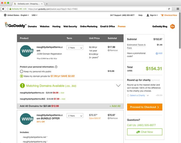
What it is: A site adds a product to your shopping cart – usually through the use of a selected radio button or pre-selected checkbox – without the user noticing.
Example: Sites like GoDaddy add on items when you are buying a website domain. When you decide to purchase a website domain, they will try to add on domain protection without you noticing by having that box checked when adding to your cart.
-
11. Trick Questions
What it is: A question looks like it says one thing, but once read more closely, it says another.
Example: This commonly happens when a user is filling out a form. The bottom of a form will have a couple of check boxes. One checkbox will have a positive message. For example, “Please sign me up…” Another checkbox will have a negative message. For example, “Please do not send me…”. When you read both of the checkboxes, you realize you want to check the one that is positive and not check the negative. But, at first glance, it may look like the opposite.
All dark UX patterns play on the psychology of the user interface. If you create positive experiences for your users and don’t use devious, seedy practices to obtain their information or sell them more products, you have a much better chance of getting them to come back to your website.
If your site currently uses dark UX patterns, it is not too late to change. Most ways to change these practices are rather quick and painless. Instead of deceiving your users, help them achieve their goals as well as your own.

The world of marketing has changed drastically in the last decade. With the window to the world at their fingertips, buyers are empowered to proactively find products and services to meet their needs before ever talking to you. Do you know if your marketing programs are working? Are your prospects finding the content they need to make informed decisions? In the following article, we identify 5 signs your company is ready for marketing automation.
The world of marketing has changed drastically in the last decade. With the window to the world at their fingertips, buyers are empowered to proactively find products and services to meet their needs before ever talking to you. Do you know if your marketing programs are working? Are your prospects finding the content they need to make informed decisions? In the following article, we identify 5 signs your company is ready for marketing automation.
The world of marketing has changed drastically in the last decade. With the window to the world at their fingertips, buyers are empowered to proactively find products and services to meet their needs before ever talking to you. Do you know if your marketing programs are working? Are your prospects finding the content they need to make informed decisions? In the following article, we identify 5 signs your company is ready for marketing automation.